Take Matters Into Your Own Hands
EQ Bank offers a digital Savings Plus account for independent customers seeking an alternative to traditional banking solutions.
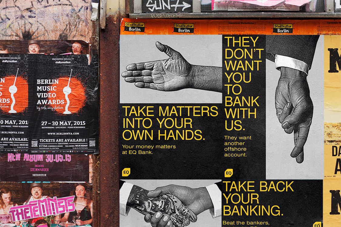
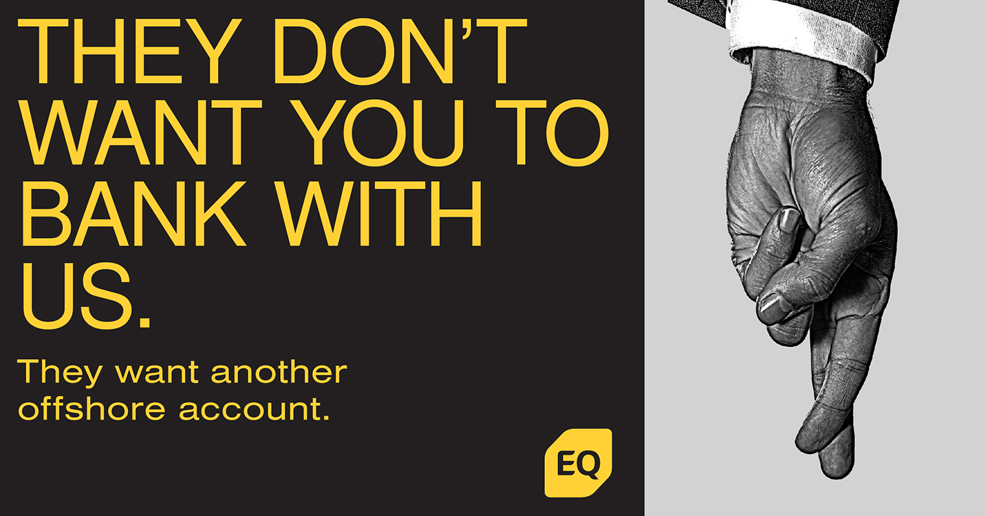
EQ Bank's campaign represents a significant shift in the Canadian banking landscape, targeting a specific demographic of tech-savvy, independent individuals who are seeking an alternative to the traditional banking experience provided by the big five banks. The campaign's design language is crucial in conveying the message of empowerment, independence, and modernity, which resonates with its target audience. The choice to reposition EQ Bank as "Canada's Challenger Bank" already sets the tone for a disruptive and innovative approach. This branding immediately signals to potential customers that EQ Bank is not just another conventional bank but rather a forward-thinking alternative. EQ Bank recognizes that these individuals are not only early adopters of new technology but also avid online researchers of financial advice and banking solutions. This campaign capitalizes on these behaviours by positioning EQ Bank as a source of financial empowerment, catering to the specific needs and preferences of this demographic. The design language, which incorporates the symbol of a hand, the hand symbolizes ownership, control, and independence. It communicates the idea that EQ Bank customers have the power to shape their financial future. This imagery effectively conveys the message that EQ Bank empowers individuals to take their banking into their own hands, underlining the theme of autonomy. The campaign's heavy reliance on social media as a primary platform aligns with the target audience's tech-savviness and their inclination to seek financial advice online. By participating in discussions on personal finance tips and goals, EQ Bank not only engages with potential customers but also positions itself as a valuable resource for financial guidance. In summary, the EQ Bank campaign's design language and strategic approach hold significant importance in redefining the banking experience for a specific demographic in Canada. By leveraging modern design elements and an empowering message, EQ Bank aims to challenge the dominance of traditional banking giants, offering a fresh and digitally driven alternative that speaks directly to the desires and needs of its intended audience. This campaign represents a shift towards more customer-centric and contemporary banking solutions in Canada's financial landscape.
Strike Design Studio offers frank consultancy and striking solutions for IRL and URLS. Designing brands, websites, and printed matter.
